
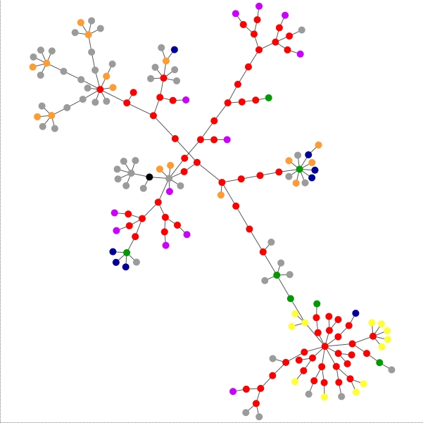
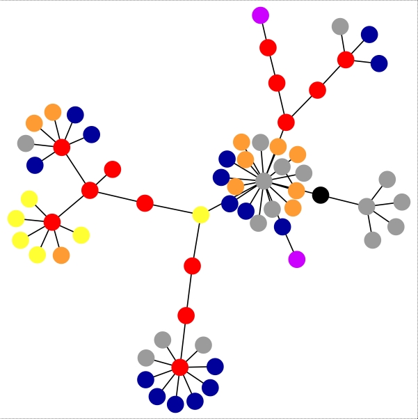
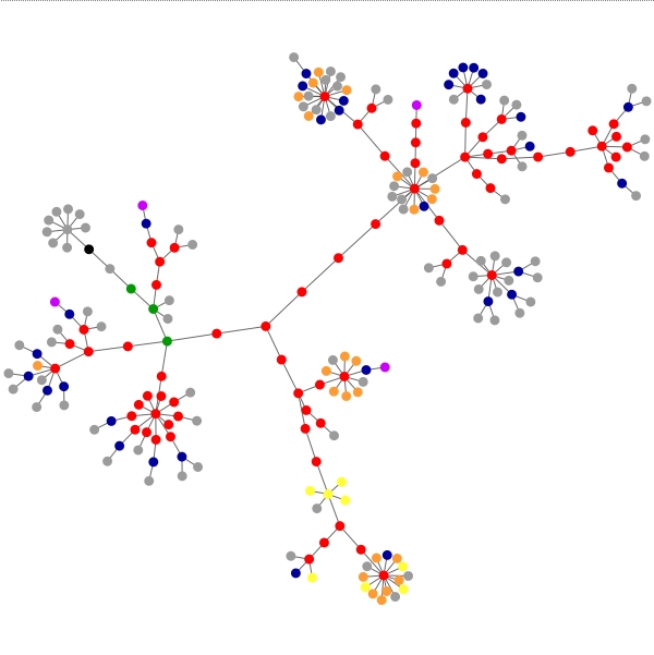
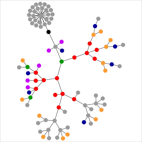
- What do all the colors mean?
blue: for links (the A tag)
red: for tables (TABLE, TR and TD tags)
green: for the DIV tag
violet: for images (the IMG tag)
yellow: for forms (FORM, INPUT, TEXTAREA, SELECT and OPTION tags)
orange: for linebreaks and blockquotes (BR, P, and BLOCKQUOTE tags)
black: the HTML tag, the root node
gray: all other tags
I'm not geeky enough to look at the graphs and decide that some need more tables included (red) or anything like that. I just think they looks purty! You can go here to make your own! Be sure to click on these to get the full effect! (NOTE: it's a time-consuming process. Fun to watch at first, but it'll take while)
My site, and my gmail site:

"...the Other HNT", and the site of a very popular HNTer:


apple.com and blogger.com:

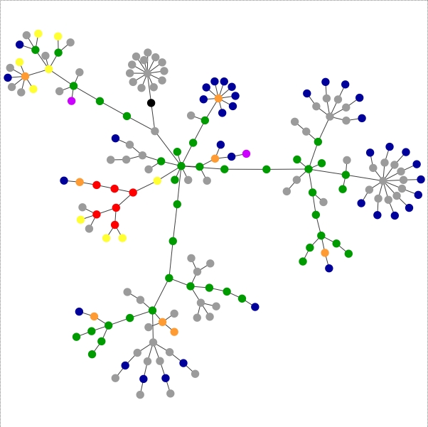
google.com and yahoo.com:

sitemeter.com, and my flickr.com friends page:
and finally, two more popular bloggers:


No comments:
Post a Comment